

Modern design that stands out and inspires.
I create designs that combine aesthetics with functionality – from minimalist logos and creative visual identities to refined materials for print and digital media. For me, every project is a story told through color, shape, and typography.
I invite you to explore my portfolio – here you’ll find works where passion meets professionalism, and ideas are transformed into visual narratives.
About the Product
This project focused on a comprehensive brand refresh aimed at modernizing the visual identity of the company and introducing a more innovative, cohesive, and future-oriented design system across all key touchpoints.
Project goal
The redesign was built around a refined visual language that combines clean medical aesthetics with technological sophistication.
A refreshed color palette, subtle gradient transitions, and geometric patterns were introduced to enhance brand recognition while
maintaining a professional and trustworthy character aligned with the healthcare sector.
As part of the rollout, I developed a wide range of branded assets. This included professional virtual backgrounds for Microsoft Teams,
designed to ensure consistent and polished communication in remote meetings. Additionally, I created new business cards for employees,
focusing on clarity, hierarchy of information, and a premium, minimalistic finish.
The scope also covered printed materials and business presentations, where the new visual system was translated into structured, easy-to-navigate
layouts. These materials were designed to support both internal communication and external business development, ensuring consistency across
digital and physical formats.
A key objective throughout the project was to create a scalable and flexible design system that can adapt to various use cases—from corporate
communication to marketing and sales—while maintaining a strong and recognizable brand identity.
Outcome
The result is a unified and modernized brand experience that enhances professionalism, strengthens visual consistency, and supports the company’s positioning as an innovative player in the medical industry.
About the event
World Health Expo Dubai is a major international healthcare event that brings together global medical companies, innovators, and industry professionals in one place. It focuses on showcasing the latest advancements in medical technology, products, and services, while creating strong opportunities for networking, business development, and knowledge exchange across the healthcare sector.
Design
This project involved the design of a large-scale exhibition wall created for a medical event in Dubai, developed to reflect the
premium and innovative character of the brand within a highly competitive, international environment.
The structure was based on a modular booth concept, with a main feature wall measuring 3 meters in height and 6 meters in width,
forming the visual centerpiece of the stand. The design extended beyond a single flat surface, incorporating architectural elements
such as a portal/entrance frame (arch/lintel), side panels, and integrated display zones, all of which required a consistent and well-balanced
visual system.
A key challenge was to translate complex medical content into a clear, engaging, and visually accessible format at scale. The layout was
carefully structured to guide the viewer’s attention—from high-level brand messaging to detailed product information while maintaining strong
readability from various viewing distances typical for trade shows.
Special attention was given to brand visibility and hierarchy. Multiple touchpoints across the booth including the main wall, side structures,
and additional elements required precise placement of the company’s logos and product identifiers. This ensured consistent brand recognition
regardless of the viewer’s position within the space.
The visual language was built around a clean, clinical aesthetic combined with dynamic gradients, subtle depth effects, and high-quality medical
imagery. The color system and iconography were aligned with the existing product line, reinforcing coherence between packaging, marketing materials,
and the physical exhibition presence.
Outcome
Overall, the project resulted in a cohesive, high-impact exhibition environment that effectively supports business conversations, enhances brand perception, and communicates key product advantages in a professional and engaging manner.
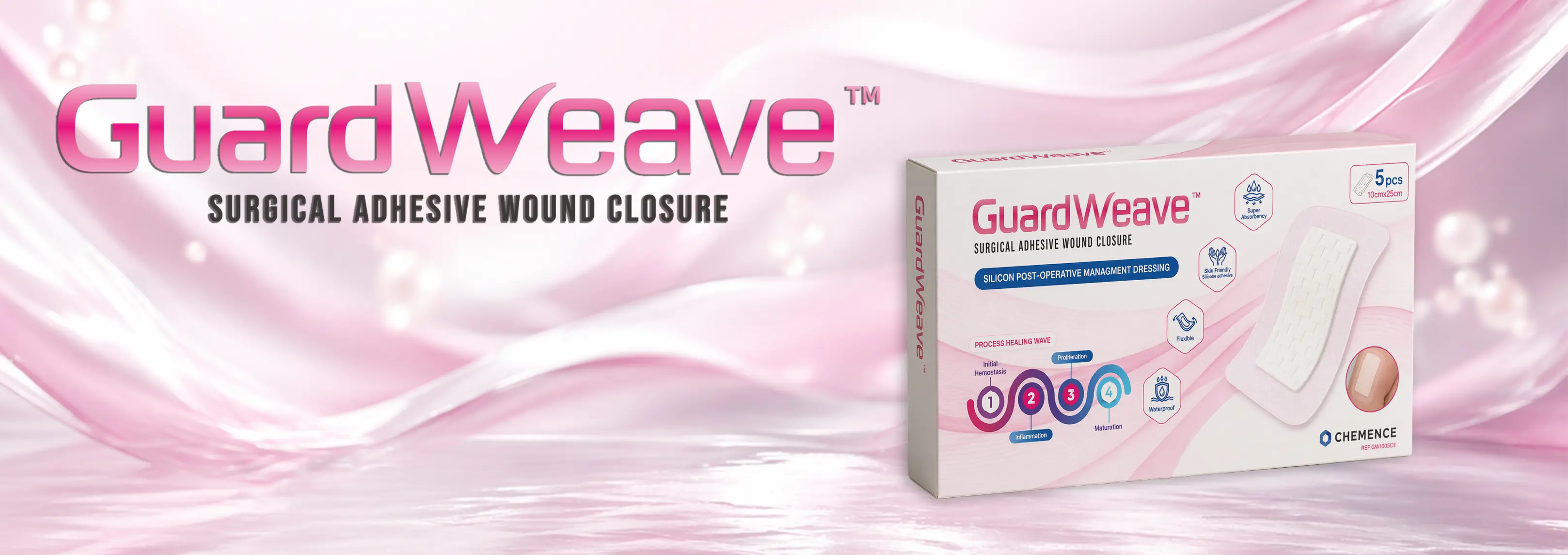
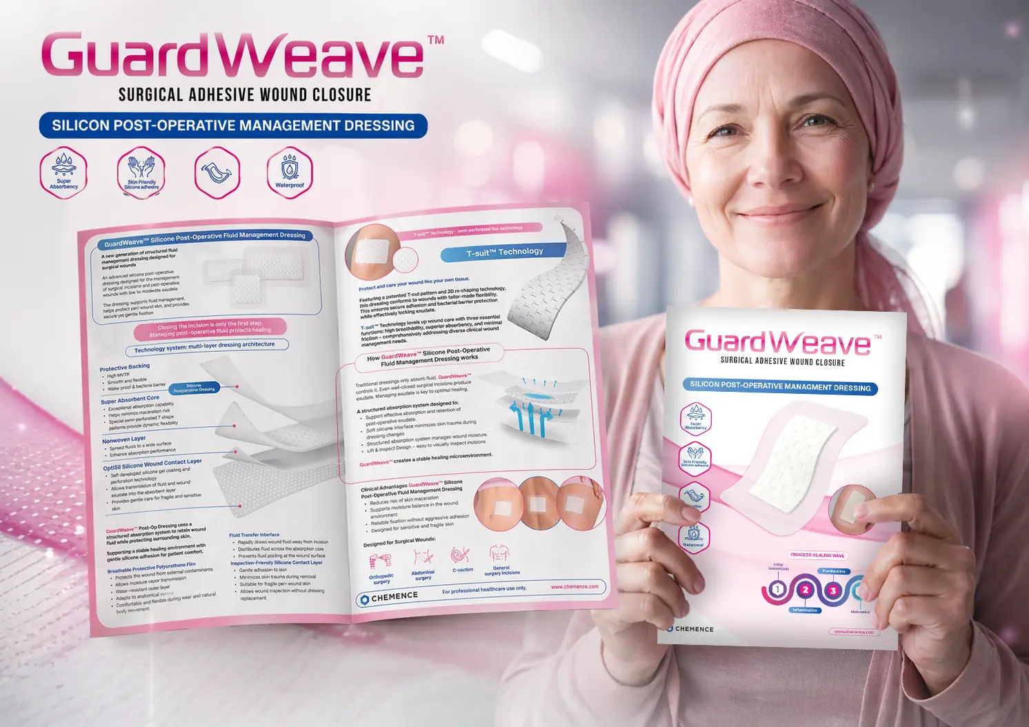
About the Product
GuardWeave™ is a medical-grade silicone wound care solution designed for post-operative use and advanced wound management. These specialized adhesive dressings are applied after surgical procedures to protect the wound, support optimal healing conditions, and reduce the risk of complications. Thanks to their gentle silicone adhesion, they are skin-friendly and minimize irritation, while the flexible, breathable, and waterproof structure ensures comfort and durability in everyday use. GuardWeave™ combines protection with patient comfort, making it suitable for sensitive, healing skin.
Project Scope
This project involved the creation of a complete product identity from the ground up, covering both visual branding and sales-support materials. I began with the design of a new logotype, establishing a modern and distinctive visual foundation aligned with the product’s medical positioning and premium character. Building on this, I developed the packaging design, focusing on clarity, trust, and strong shelf presence. The layout was carefully structured to communicate key product benefits, usage context, and technological advantages in a clear and accessible way. The project was then expanded to include educational and sales materials, such as a product brochure and a set of business presentations for sales teams. These materials were designed to effectively communicate product value, support product launches, and facilitate conversations with healthcare professionals.
Objectives
The main goals of the project were:
- To create a strong and recognizable brand identity for a new medical product
- To clearly communicate clinical benefits and product functionality
- To ensure consistency across all touchpoints, from packaging to sales materials
- To support sales and marketing efforts with clear, professional communication tools
Design Approach
The visual direction combines a clean, medical aesthetic with soft, reassuring tones, reflecting both clinical reliability and patient comfort. Subtle gradients, light effects, and structured iconography were used to emphasize innovation and technology, while maintaining a calm and approachable look.
Outcome
The result is a cohesive and scalable product ecosystem, including branding, packaging, and communication materials, that effectively positions GuardWeave™ as a modern and reliable solution in post-operative wound care.
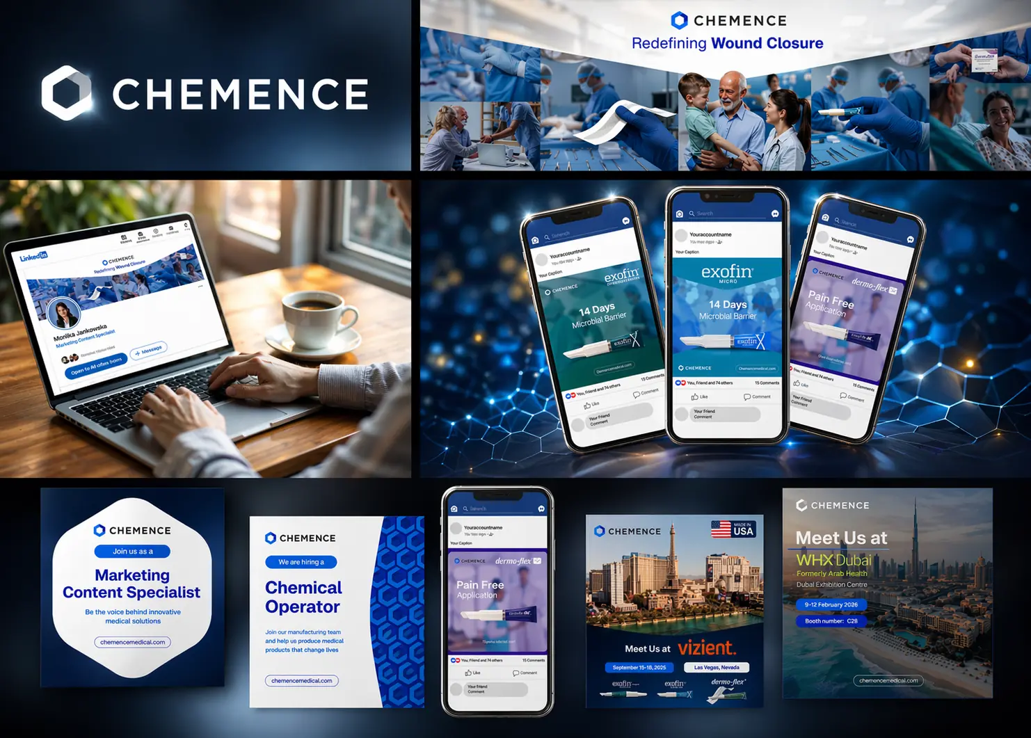
About the Product
This project focused on the development of a refreshed visual identity for social media communication, aligned with the brand’s evolving positioning and the need for a more modern, consistent, and engaging digital presence. The scope included the creation of a cohesive design system tailored for platforms such as LinkedIn and mobile-first formats. The new visual language was built around a clean, professional aesthetic, combining structured layouts, medical-grade color palettes, and subtle technological motifs to reinforce innovation and credibility.
Project Scope
A key objective was to standardize communication while maintaining flexibility across different content types. I designed a series of modular templates covering product highlights, educational posts, recruitment announcements, and event promotions. Each format follows a clear hierarchy of information, ensuring strong readability and immediate message clarity in fast-scrolling environments. Special attention was given to mobile optimization, with layouts and typography adapted for smaller screens without compromising visual impact. Consistent use of gradients, lighting effects, and branded elements helped create a recognizable and scalable system that strengthens brand recall across all touchpoints.
Outcome
The result is a unified and future-proof social media framework that enhances visual consistency, supports marketing and HR activities, and elevates the overall perception of the brand in digital channels.
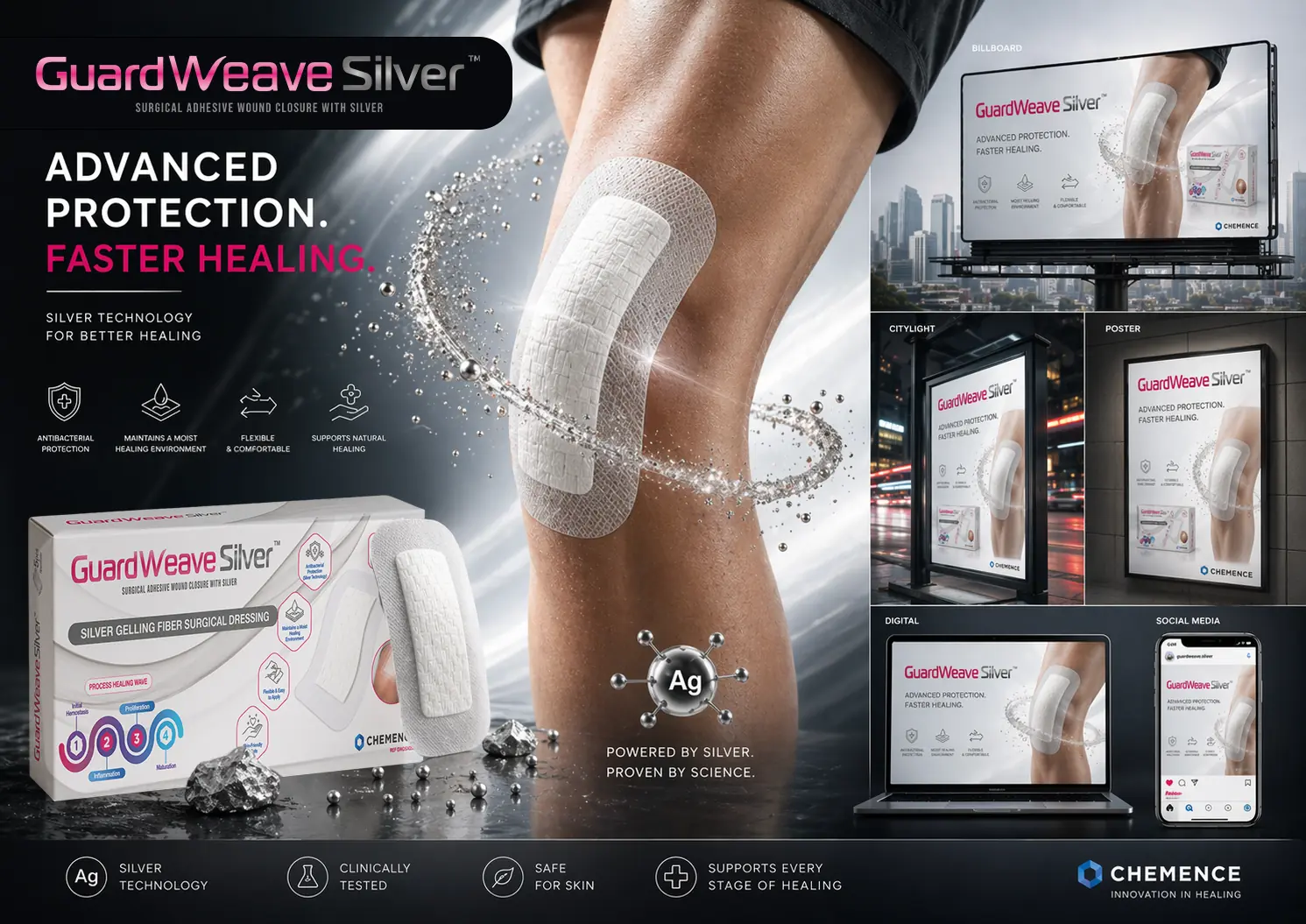
About the Product
GuardWeave Silver™ is an advanced medical dressing designed for post-operative wound care, enhanced with silver technology (Ag) known for its antibacterial properties. The product supports faster healing by maintaining an optimal moist environment, reducing the risk of infection, and protecting the wound throughout all stages of recovery. Its structure combines flexibility, breathability, and strong yet gentle adhesion, ensuring patient comfort while delivering clinically reliable performance.
Project Scope
This project was an extension of the GuardWeave line, focused on creating a distinct sub-brand identity for the Silver variant,
emphasizing advanced technology and enhanced clinical performance.
The process began with the development of a dedicated visual direction and logotype adaptation for GuardWeave Silver™,
introducing a more technological and high-performance aesthetic. Darker tones, metallic accents, and dynamic visual elements were used to
highlight the presence of silver and reinforce innovation.
I then designed the product packaging, ensuring clear differentiation from the base product while maintaining brand consistency.
The packaging communicates key benefits such as antibacterial protection, faster healing, and clinical validation in a structured and accessible way.
The project expanded into a full 360° marketing campaign, including:
- Outdoor advertising (billboards, citylights, posters)
- Digital assets for websites and presentations
- Social media creatives optimized for mobile platforms
- Key visual system for consistent campaign rollout
Objectives
- To position GuardWeave Silver™ as a premium, technology-driven medical solution
- To clearly communicate the benefits of silver in wound healing
- To create a strong visual distinction within the existing product line
- To deliver a consistent and scalable campaign system across all channels
Design Approach
The visual concept is centered around “advanced protection and accelerated healing.” The design combines a clean medical foundation with dynamic, high-tech elements, such as liquid-metal effects and molecular references to silver (Ag), reinforcing scientific credibility. The use of contrast—between soft human skin and sharp, metallic visuals—helps communicate both gentleness and strength, key attributes of the product.
Outcome
The result is a cohesive and high-impact product ecosystem, from packaging to global campaign materials, that successfully positions GuardWeave Silver™ as an innovative, clinically advanced solution in post-operative wound care.
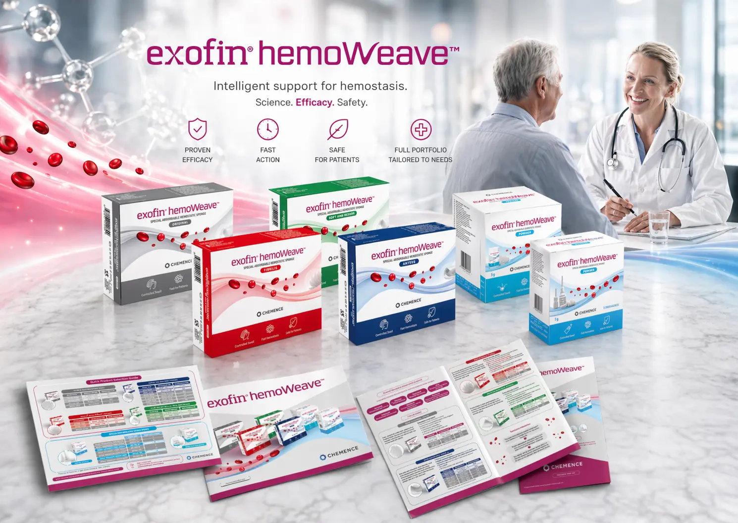
About the Product
Hemostats are specialized medical products designed to rapidly control and stop bleeding. They support the body’s natural clotting process and are widely used in surgery, dentistry, and other medical procedures where effective hemostasis and patient safety are critical.
Project Scope
For the exofin® hemoWeave™ product line, I was responsible for delivering a complete product design package. I finalized the packaging design, creating a cohesive, modern, and clinically aligned visual identity that emphasizes the product’s efficacy and innovation. In addition, I designed two types of product brochures tailored for both professional use and sales support. Each layout was developed with a strong focus on clarity, information hierarchy, and a clean medical aesthetic.
Outcome
The project was complemented by a sales presentation that communicates key product benefits in a clear and engaging way, effectively supporting commercial activities and strengthening the brand’s professional image
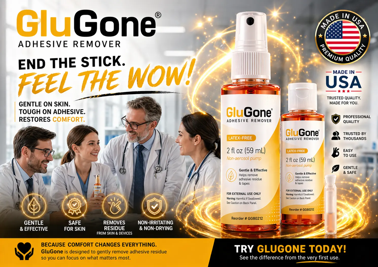
About the Product
GluGone® is a medical adhesive remover designed to safely and effectively eliminate adhesive residue from the skin and medical devices. It is commonly used in clinical and home-care settings to remove tapes, dressings, and other adhesives without causing irritation. Its gentle, non-drying, and latex-free formula ensures patient comfort while maintaining high performance.
Project Scope
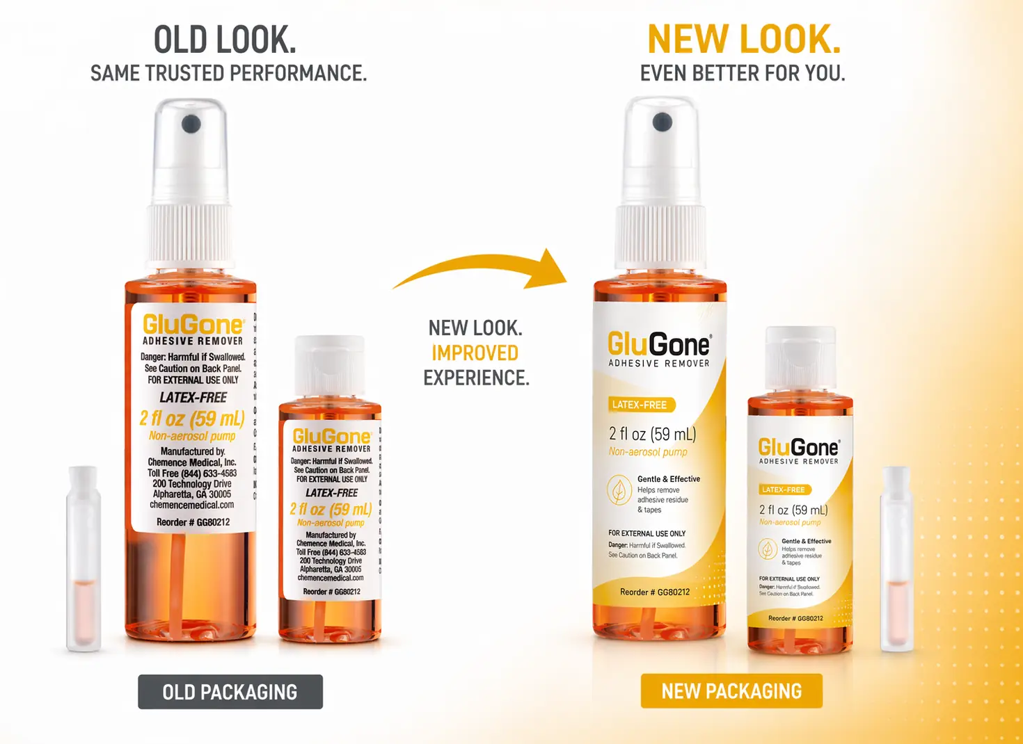
This project focused on a complete rebranding and visual refresh of the GluGone® product line, aimed at improving clarity,
shelf appeal, and overall brand perception.
I began with a redesign of the product labels, transforming the previous, more technical and less engaging look into a modern,
clean, and consumer-friendly visual identity.
The new design introduces a stronger color system (with warm orange tones), improved typography,
and a clearer hierarchy of information, making key product benefits more visible and easier to understand.
The packaging evolution is clearly reflected in the transition from the old to the new design, where the updated version enhances readability,
strengthens branding, and delivers a more premium and cohesive appearance.
Building on the new visual identity, I developed a full marketing campaign, including:
- Key visual and advertising concept (“End the Stick. Feel the WOW!”)
- Product-focused visuals highlighting ease of use and effectiveness
- Lifestyle imagery centered around comfort, family, and everyday use
- Icon system communicating key benefits such as safety, gentleness, and effectiveness
Objectives
- To modernize the product’s visual identity and improve market competitiveness
- To clearly communicate product benefits and ease of use
- To create a strong emotional connection through comfort-driven messaging
- To ensure consistency across packaging and marketing materials
Design Approach
The new design direction combines medical credibility with a more approachable, consumer-oriented aesthetic. Warm colors, dynamic light effects, and expressive typography were used to create a sense of energy and immediacy, reinforcing the product promise of fast and comfortable adhesive removal. The inclusion of human-centered visuals (family context) strengthens the emotional appeal, while clean layouts and structured information maintain professional clarity.
Outcome
The result is a cohesive rebranded product line and campaign, where packaging, messaging, and visual communication work together to enhance recognition, improve user understanding, and position GluGone® as a modern, effective, and user-friendly solution in adhesive removal.
About the Product
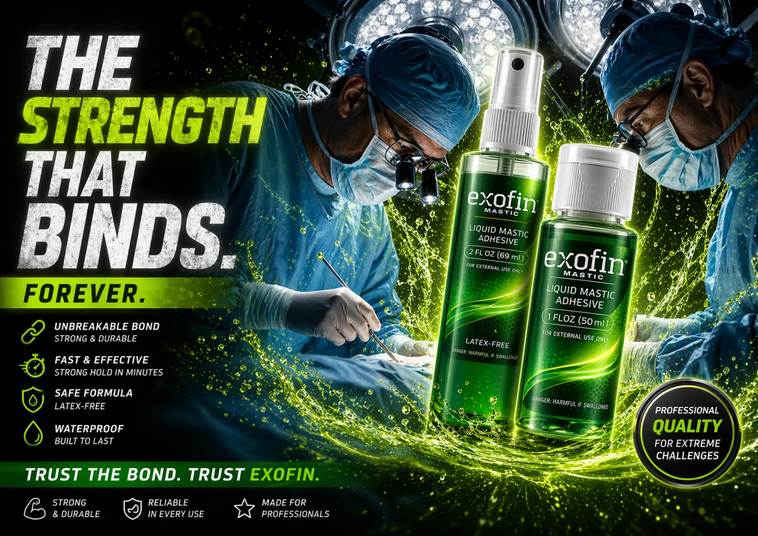
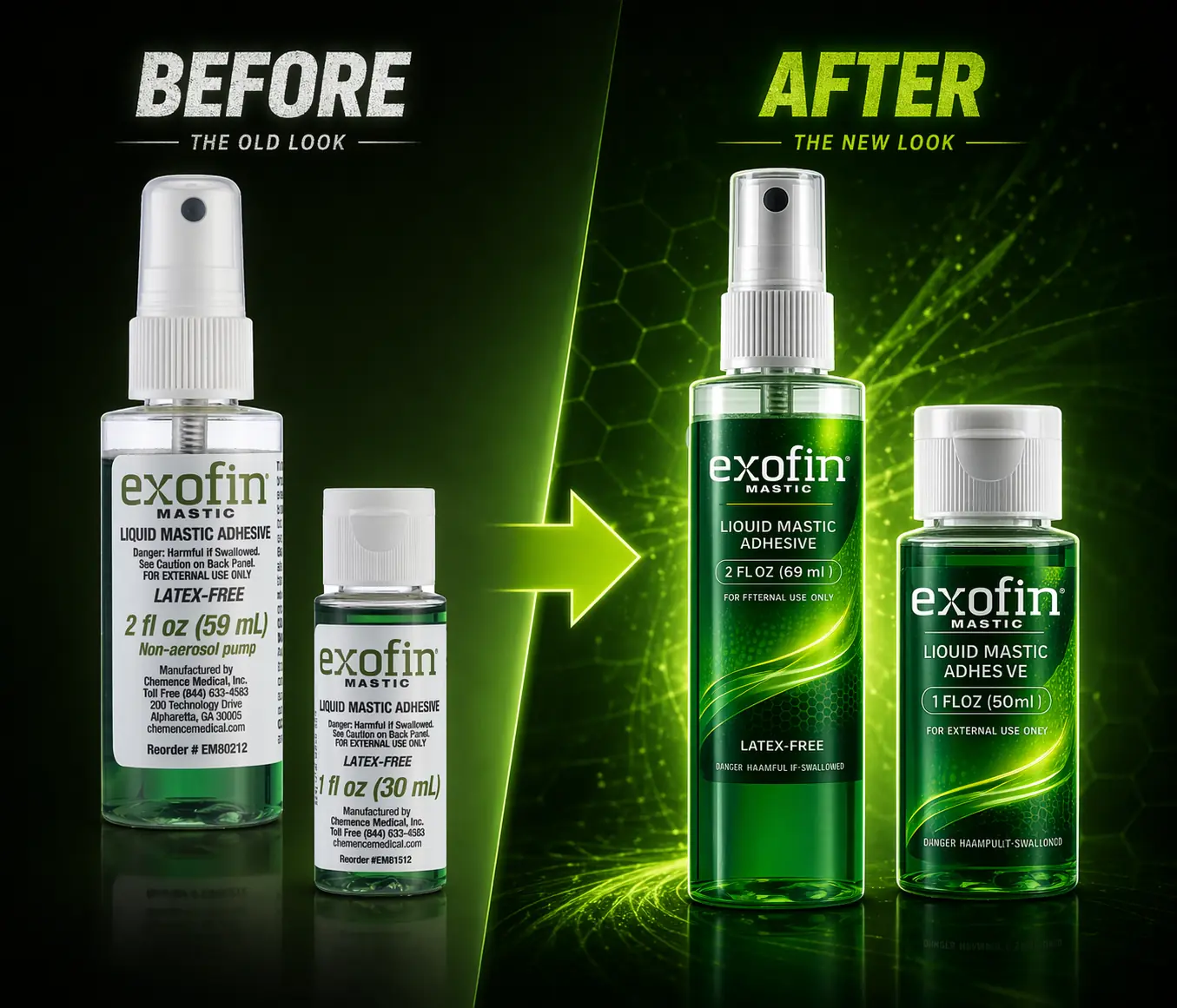
Exofin® Mastic is a professional-grade liquid mastic adhesive used in medical settings to secure dressings, tapes, and devices to the skin. It provides a strong, durable, and waterproof bond, ensuring reliable fixation even in demanding conditions. The formula is latex-free, fast-acting, and safe for skin, making it suitable for clinical use where performance and patient safety are essential.
Project Scope
This project focused on a complete rebranding and visual refresh of the Exofin® Mastic product line,
along with the development of a new high-impact marketing campaign.
The process began with a redesign of the product labels, transforming them into a more modern, dynamic,
and visually distinctive system.
The new design introduces a bold green color palette, enhanced gradients,
and fluid graphic elements that visually communicate strength, adhesion, and durability.
The updated packaging improves readability, hierarchy of information, and shelf visibility,
while reinforcing the product’s positioning as a professional, high-performance solution.
Building on the new identity, I developed a comprehensive campaign concept, including:
- Key visual and campaign direction (“The Strength That Binds. Forever.”)
- Product-focused compositions emphasizing durability and performance
- Clinical context visuals featuring surgical environments to reinforce credibility
- Iconography system highlighting key benefits such as strength, speed, safety, and waterproof performance
Objectives
- To modernize the visual identity and strengthen product differentiation
- To clearly communicate performance-driven benefits
- To position Exofin® Mastic as a premium, professional-grade adhesive
- To create a cohesive visual system across packaging and marketing materials
Design Approach
The visual direction is built around the concept of strength and permanence. Dynamic liquid effects and energetic compositions were used to symbolize bonding power and resilience, while the surgical background reinforces real-world application and trust. The contrast between clinical environments and vibrant, high-energy graphics creates a balance between medical credibility and strong visual impact.
Outcome
The result is a refreshed and cohesive product identity, supported by a bold and memorable campaign that elevates brand perception, enhances product visibility, and effectively communicates the core value of Exofin® Mastic a bond you can trust in any condition.

About the product
LiquidSkin® is a topical medical solution designed to protect minor cuts, cracks, and abrasions by forming a flexible, waterproof barrier over the skin. It acts as a “liquid bandage,” supporting natural healing while providing durable, invisible protection in everyday situations.
Project Scope
This project involved a complete visual transformation of the product, starting from the ground up.
I led a full rebranding process, redefining the color palette, typography, and overall visual direction to create a more modern,
consumer-friendly identity. The new design language was built around the themes of family, safety, and everyday reliability,
making the product more approachable while maintaining its medical credibility.
A key element of the project was the redesign of the packaging, developed entirely from scratch.
The new packaging introduces a clear hierarchy of information, stronger shelf visibility, and a more engaging front-facing
communication that highlights key benefits such as fast drying, waterproof protection, and flexibility.
Following the packaging redesign, I extended the new visual identity into a comprehensive 360° campaign.
This included a wide range of marketing assets visible in the project:
- Retail-ready display packaging and point-of-sale materials
- Outdoor advertising, including billboard and citylight formats
- Digital and social media creatives, optimized for mobile platforms
- Lifestyle-driven campaign visuals, emphasizing real-life use cases and emotional connection
The creative direction consistently reinforces the core message of “Invisible Protection. Real Relief.”, supported by imagery focused on active families and everyday moments. This approach strengthens both the functional and emotional value of the product.
Outcome
The result is a cohesive and scalable brand ecosystem that elevates product perception, improves market visibility, and effectively communicates the benefits of LiquidSkin® across both physical and digital channels.

Client
Chemence Medical – a global medical company specializing in advanced wound closure products. Scope of work: development of a new layout and comprehensive design for business presentations dedicated to partners, sales representatives, and distributors.
Project description
The objective of this project was to create a visually cohesive and engaging product presentation for derma+flex® – a surgical skin adhesive used by medical professionals. The previous presentation required restructuring and modernization to better reflect the innovative nature of the product and support clear communication with an international audience.
The design process included
- Developing a new presentation layout that ensures consistency and clarity
- Using a color scheme inspired by the derma+flex® product packaging to strengthen brand recognition
- Creating original medical illustrations that simplify the understanding of complex medical processes
- Preparing realistic product visualizations to highlight key features and applications
- Organizing and structuring the content to present information in a logical, user-friendly way.
The result
The result is a modern, professional business presentation that is both visually appealing and highly informative. Thanks to the refreshed layout, custom illustrations, and clear communication structure, Chemence Medical gained a tool that supports effective product promotion, strengthens trust among partners, and enhances the brand’s innovative image in the medical market.


Chemence Medical
Chemence Medical – an international medical company specializing in advanced wound closure solutions, rapidly expanding its presence on global markets.Scope of work: redesign and modernization of visual materials for both print and digital use, including layouts for brochures, leaflets, presentations, online graphics, and guidelines for consistent communication.
Project description
The goal of this project was to refresh and unify the company’s communication materials in line with its dynamic growth and global aspirations. The previous layouts no longer reflected the innovative and professional character of Chemence Medical. The task was to introduce a modern, minimalist design system that would enhance clarity, ensure readability, and strengthen brand recognition across different communication channels.
The design process included
- Analyzing the existing materials and identifying areas requiring modernization
- Developing a new visual language based on simplicity, precision, and consistency
- Creating modular layouts adaptable for both print and digital use
- Implementing clear typography and a refined color palette aligned with the medical industry’s standards
- Preparing templates for brochures, product sheets, presentations, and online graphics
- Ensuring the new system allows for scalability and quick adaptation to future needs
The result
The result is a cohesive, contemporary visual identity that replaces outdated methods with a clean and professional look. The redesigned materials are modern, readable, and aligned with the innovative nature of Chemence Medical, supporting the company’s sales, marketing, and medical communication worldwide.


Project Overview
Organic Ceramic is a private ceramics studio crafting 100% of its products in-house—each one handmade and imbued with authenticity. The brand sought a visual refresh that balanced raw organic textures with a modern aesthetic, conveying natural beauty with sophisticated design coherence.
Scope of Work & Deliverables
1. Logo Refresh
The existing logo was subtly refined
to modernize its appearance while preserving its artisanal
character ensuring it carried the heritage of the brand into a
contemporary visual identity.
2. Printed Brand Collateral
- Business Cards: Crafted with thoughtful minimalism, reinforcing the brand's identity through tactile and visual simplicity.
- Envelopes: Designed to reflect authenticity and understated elegance.
- Thank-You Cards: Personalized inserts included with each purchase—fostering emotional connection and reinforcing brand warmth.
- Letterhead: Developed for formal communication, carrying a refined yet natural feel aligned with the product aesthetic.
3. Photo Session Direction & Styling
- Directed a photoshoot that captured the ceramics' raw textures and natural form, employing minimalistic, earthy styling and natural lighting to reinforce the studio's artisanal essence.
- Coordinated product placement, prop selection, and mood to mirror the brand's modern, natural aesthetic.
4. Post-Production & Promotional Material Creation
- Edited photographs for clarity, warmth, and consistency enhancing the ceramics' tactile appeal and visual narrative.
- Used the resulting photography to design promotional materials for clients, ensuring visual identity carried across all touchpoints.
Design Philosophy & Brand Alignment
- Raw Elegance - Visuals emphasize natural textures and simple forms to highlight the handcrafted nature of the products.
- Modern Authenticity - The refreshed logo and printed materials balance rustic charm with contemporary design refinement.
- Unified Visual Language - From stationery to photo content, every brand asset speaks with the same visual clarity and emotional resonance.
Conclusion
The Printed Materials & Photo Session Arrangement project provides a holistic visual foundation for Organic Ceramic bridging craftsmanship, authenticity, and modern design. Every touchpoint from a business card to client-facing promotional materials is infused with the brand's identity: natural, handcrafted, and thoughtfully curated.


Project Overview
Wild Essence is a bold and forward-thinking skincare brand that celebrates innovation and authenticity. Offering natural cosmetics for women, the brand stands out by blending high-quality ingredients with modern, fearless visual storytelling. Tasked with designing a new advertising campaign, the brief called for a visual identity that honors the brand's essence natural beauty, clean formulas, and sharpened aesthetics while resonating with contemporary digital trends.
Design Concept & Creative Strategy
- Human + AI Synergy: To embody both organic allure and futuristic appeal, the campaign's key visual was generated using AI tools under my creative direction—creating an unexpected, eye-catching visual vocabulary that feels at once natural and forward-looking.
- Visual Storytelling with Duality: The key visual merges elements of natural beauty (soft botanical textures, mineral hues) with unexpected, futuristic aesthetics (AI-generated abstract patterns and forms). This contrast underscores Wild Essence's identity: rooted in nature, yet confidently futuristic.
Scope & Deliverables
- Advertising Banners: Designed for both print and digital placements, these banners leverage the AI-driven key visual to make a bold statement while maintaining brand cohesion.
- Product Labels: Applying a softer, more organic version of the key visual that enhances the packaging—clean, gentle, and whispering of botanical purity.
- Product Catalog: A minimalistic, elegant layout that showcases the brand's philosophy, product range, and ingredient integrity—framed by the dualistic design language.
- Social Media Assets: A consistent suite of visuals tailored for social platforms, ensuring the campaign's visual identity remains strong and recognizable across environments and formats.
Strategic Impact
- Innovation Meets Authenticity: The use of AI tools in concert with thoughtful creative direction reflects Wild Essence's tech-forward yet grounded brand ethos.
- Strong Visual Identity: The distinctive key visual serves as a memorable anchor for all collateral, ensuring consistency across channels and a cohesive brand narrative.
- Adaptive and Scalable Design: From immersive banners to fine details on labels, the visual system flexibly adapts—maintaining resonance and clarity.
Why It Works
- Emotional Connection: The visual language establishes intimacy through natural elements while arousing curiosity through its futuristic undertone.
- Visual Cohesion Across Touchpoints: Every asset—from print to digital—shares a unified aesthetic, reinforcing brand recall and positioning.
- Reflects Brand Philosophy: The visuals embody Wild Essence's commitment to purity and progress, making the campaign both visually compelling and conceptually aligned.
Conclusion
The Wild Essence - Key Visual campaign redefines how brands can embrace both the natural and the technological. Through an AI-infused visual strategy executed with intentional creative direction, it elevated the brand's narrative to reflect authenticity, innovation, and powerful design—building a visually compelling identity that's both modern and meaningful.


Project Overview
Modern Science is an innovative collective dedicated to making science accessible and engaging, tailored for a modern audience seeking knowledge presented in a visually appealing and easy-to-digest format. The objective of this project was to create a new key visual that would serve as the central point of the brand's communication across both digital and print channels, as well as to design a complete set of supporting materials for advertising campaigns and day-to-day communication.
Scope of Work & Deliverables
1. Key Visual Design
- Developed the main graphic motif that became the foundation for the entire brand communication.
- Selected a color palette, typography, and layout system that reflect Modern Science's values — innovation, credibility, and openness.
2. Visual Communication Framework
- Created layout templates for quick adaptation to new content, significantly speeding up the production of consistent marketing assets.
- Designed graphic elements to support brand storytelling — iconography, section dividers, and visual highlights.
3. Campaign & Communication Materials
- Email Templates: clean, visually engaging designs optimized for readability and responsive display.
- Business Cards: minimalist yet distinctive cards incorporating key visual elements, ensuring clarity and memorability.
- One-Page Website: a modern, user-friendly design that presents the collective's mission and offering in a clear, impactful way.
- Ad Banners (digital & print): a complete set of banners for online campaigns and printed advertising, fully aligned with the new visual identity.
Conclusion
The Key Visual project for Modern Science demonstrates how a well-planned visual identity can become a driving force in brand growth — enhancing not only the aesthetic appeal but also the efficiency of marketing efforts. The new design unified the brand's messaging, simplified content creation, and enabled the collective to attract and engage audiences more effectively across all communication channels.


Project Overview
This project focused on end-to-end production of short-form video content for Kapek Candles across Instagram Reels and TikTok. Kapek Candles, a brand known for 100% handmade soy candles, needed video content that could capture the sensory experience of their products, fit the fast-consumption format of social media, and maintain brand consistency.
Scope of Work & Deliverables
1. Creative Concept Development
- Researched trends in the home décor and lifestyle niche to align with viewer expectations.
- Created moodboards and storyboards for each video series.
2. Scene Styling & Cinematography
- Selected props and backgrounds aligned with the brand's eco-friendly, natural, and cozy positioning.
- Incorporated product detail shots and lifestyle scenes.
3. Video Production & Post-Production
- Shot in vertical 9:16 format for Reels and TikTok.
- Performed precise color grading and applied subtle visual effects.
- Synced visuals with carefully chosen background music.
Conclusion
This project demonstrates the power of short-form video as both a marketing tool and a brand-building asset. By integrating strategic concept design, meticulous styling, and professional editing, the Kapek Candles videos became immersive brand experiences that viewers could feel, not just watch.


Project Overview
As part of an ongoing collaboration with Kapek Candles, a brand producing 100% handmade soy candles, I took charge of the product photography and post-production process for each new collection.
Scope of Work & Core Contributions
1. Concept & Visual Strategy: For every collection, I crafted a bespoke concept aligned with the brand's aesthetic and seasonal mood.
2. Styling & Set Design: I fully managed the scene setup, using natural materials and daylight to underscore the eco-conscious nature of the products.
3. Photography & Post-Production: Handled the complete shoot process including lighting and editing to ensure each photo resonates with the brand's identity.
Conclusion
The Photography & Post-Production project for Kapek Candles illustrates how intentional visual storytelling can elevate brand perception, crafting a sensory narrative that evokes mood, quality, and authenticity.


Project Overview
This project involved the development of a complete brand identity and marketing ecosystem for Kapek Candles, a new company specializing in handcrafted, 100% natural soy candles.
Scope of Work & Key Deliverables
- Logo Design: Crafted a minimalist yet distinctive logo that embodies the natural and handcrafted character of the brand.
- Print Marketing Materials: Business Cards, Thank-You Cards, Stickers, and a Product Catalog.
- Social Media Design Templates: A suite of templates for showcasing products and brand inspiration.
- Brand Strategy & Guidelines: Formulated a clear brand strategy including mission, values, and tone of voice.
Conclusion
The Kapek Candles branding project delivered a unified and heartfelt visual identity tailored to the handmade, natural ethos of the brand, creating an emotional connection based on authenticity and care.


Project Overview
Gyncentrum Academy is a specialized training center for medical professionals. The goal was to create a cohesive and professional visual identity to emphasize the Academy's authority and prestige within the medical sector.
Scope of Work & Key Deliverables
- Brand Identity Development: Created a full visual identity, including logo, color palette, typography, and a brand book.
- Printed Materials: Promotional leaflets, posters, brochures, and administrative materials like notebooks and business cards.
- Digital Graphics: Banner ads, pop-up visuals, and social media post templates for various platforms.
Conclusion
The Gyncentrum Academy project represents a comprehensive approach to building an educational brand in the medical sector. The outcome is a scalable, flexible, and instantly recognizable communication system that supports the Academy's activities.

Project Overview
This initiative was dedicated to building, maintaining, and refining the online visual presence of a healthcare brand through targeted social media communication. The guiding principle was "design with purpose"—ensuring every visual element served a functional role in guiding the audience and building trust.
Scope of Work & Key Deliverables
- Comprehensive Social Media Graphics: Designed static and dynamic visuals for posts, carousels, and Stories.
- Storytelling Through Design: Introduced a narrative approach with thematic patterns reinforcing brand messaging.
- Platform-Specific Optimization: Tailored visuals for Instagram, Facebook, and LinkedIn.
Conclusion
This project demonstrates how thoughtful, consistent, and strategically designed social media content can significantly strengthen a brand's position. It provided the client with a scalable visual communication system ready to adapt to evolving marketing needs.


Project Overview
holsäCLINICAL is a specialized clinical research center. The project's goal was to build a complete, ready-to-use toolkit to help the center maintain consistency in all marketing and operational channels.
Scope of Work & Key Deliverables
- Print Collateral Suite: Business cards, informational leaflets, and internal documentation forms.
- Professional Photo Session: To showcase the team and provide high-resolution imagery for campaigns.
- Digital Graphics & Campaign Banners: Social media templates, display banners, and assets for email marketing.
Conclusion
The Integrated Brand Toolkit for holsäCLINICAL is a strategic communication foundation. It ensures that every interaction communicates the same values: expertise, trust, innovation, and care.


Overview
holsäMED is a multidisciplinary medical center. This project entailed creating key visuals for advertising campaigns, updating the website, and designing digital and print collateral.
Scope of Work & Deliverables
- Social Media Content Creation: Eye-catching graphics for social media posts.
- Website Content Management: Continuous updates to the website.
- Key Visual Development: Crafted multiple campaign key visuals for different medical segments.
- Print Collateral: Branded materials for both internal and patient-facing purposes.
Conclusion
This project elevated holsäMED's brand visibility and user trust. The result is a cohesive, credible, and versatile visual identity that confidently reflects the center's multidisciplinary expertise.

Overview
The redesign of Gyncentrum's website was a comprehensive digital transformation aimed at elevating the brand's online presence and improving user engagement. The project combined visual design, functional architecture improvements, content expansion, and social media integration.
Scope of Work & Key Deliverables
- Homepage Redesign: Complete overhaul of the layout for a cleaner, more intuitive navigation flow.
- Subpage Development: Dedicated subpages for each Gyncentrum clinic with location-specific services and information.
- Ad Banner Design & Integration: Creation of a cohesive banner set for promotional campaigns.
- Social Media Integration: Direct integration of the Instagram feed and social media icons.
Conclusion
The Website Redesign for Gyncentrum was a strategic rethinking of how the brand communicates online, reflecting its position as a leader in fertility and medical care.


Overview
This project entailed the creation of an extensive series of key visuals for Gyncentrum Poland Group to rejuvenate the brand's public image and highlight its current range of services.
Key Design Strategies
- Brand Evolution Through Visual Diversity: Each key visual was uniquely crafted while maintaining a consistent visual framework.
- Clear, Compelling Visual Language: Designs prioritized clarity and visual impact for large formats.
- Strategic Slogan Integration: Each visual incorporated a tailored slogan to encapsulate campaign messaging.
Conclusion
The Key Visual Campaign Series for Gyncentrum Poland Group elevated the brand's visibility, refreshed its image, and reinforced its position as a trusted healthcare leader in Poland.


Overview
This project encompassed the end-to-end creation of branded printed materials for Gyncentrum Poland Group, reflecting the brand's professionalism, trustworthiness, and medical expertise.
Scope of Work
- Design Development: Conceived the initial graphic concepts and visual system.
- Print Production Coordination: Managed production-ready file preparation with printing partners.
- Material Suite Included: Large-scale billboards, informational leaflets, business cards, and branded prescription pads.
Strategic & Brand Impact
The polished suite of materials reinforced Gyncentrum's reputation as a modern, reliable, and patient-focused medical provider, strengthening trust and recognition.


Overview
The Open Book Festival is an outdoor cultural event celebrating reading. The goal was to create a striking, memorable key visual that would represent the festival's values: accessibility, inclusivity, and the joy of reading.
Design Direction & Concept
- Bold, Minimalist Composition: The key visual relies on two contrasting colors for high visibility.
- Expressive, Accessible Typography: Strong, legible letterforms ensure clarity in all formats.
- Harmony with Nature: The minimalist approach complements the natural outdoor setting.
Conclusion
The Key Visual for the Open Book Festival is a visual embodiment of the festival's mission: to celebrate literature as a bridge between people, ideas, and the natural world.


Overview
This project involved refreshing the promotional campaign for Travel PP - the Incentive Travel Center of TUI Poland. The goal was to present new travel offers in a more modern, engaging, and trend-aligned way.
Design Direction & Concept
- Modern Visual Tone: The campaign's visual style was updated with a fresh, dynamic aesthetic.
- Engaging Promotional Assets: Custom visuals were created to enhance the emotional appeal of each trip.
- Alignment with TUI's Brand Identity: The refresh maintained full consistency with TUI's global branding guidelines.
Impact & Strategic Value
A modernized visual presentation elevates the perceived value of the trips, increases marketing effectiveness, and reinforces Travel PP's reputation as a trusted travel advisor.


Overview
This project stems from a collaboration with Medicine, a Polish fashion label known for pushing creative boundaries. The contribution involved the creation of custom illustrations for textile prints and packaging visuals.
Design Direction & Concept
- Artist-Driven Collaboration: The project emphasized bespoke artistry, resulting in visually striking and exclusive designs.
- Hand-Drawn Illustrative Style: Custom, hand-drawn illustrations provided an authentic, artisanal quality.
Strategic Value & Brand Synergy
By incorporating exclusive, artist-created designs, Medicine reinforces the appeal of limited-edition collections, redefining fashion as a form of art rather than merely apparel.
MEDICINE


Overview
This project focused on the comprehensive rebranding of Rioja, a vegetarian restaurant built around strengthening human connections through food. The rebrand was a strategic transformation aimed at aligning every design element with the restaurant's values: hospitality, sustainability, and a celebration of nature.
Design Direction & Concept
- Value-Driven Transformation: The rebrand began with a deep dive into Rioja's mission to nurture human connection.
- Nature-Inspired Aesthetic: The concept employs organic textures, earthy tones, and natural shapes.
- Holistic Brand System: The visual identity was designed for seamless application across every guest touchpoint.
Conclusion
The Rioja Rebranding project demonstrates how thoughtful, value-driven design can transform brand perception, strengthen customer loyalty, and provide a cohesive visual language.


Overview
This project involved the complete design of a print layout and custom vector illustrations for the article "How We View Free Time Is Making Us Less Happy." The aim was to create a visual composition that reinforces the article's core message.
Design Direction & Concept
- Subtle Vector Illustrations: A muted color palette ensures the visuals support the text without overpowering it.
- Geometric Decorative Elements: Shapes were integrated to bring structure and rhythm to the layout.
- Seamless Image-Text Integration: The composition guides the reader's eye naturally.
Editorial Value & Emotional Impact
A consistent and refined visual approach underscores the quality and credibility of the content, aligning with the standards of modern editorial design.


Objective & Context
This project involves designing a compelling one-page website for a startup centered on plants and houseplant care, rooted in the eco-conscious message: "No waste."
Design Concept & Strategy
- Streamlined One-Page Layout: Delivers key content through a smooth narrative flow.
- Purpose-Driven Visual Storytelling: Imagery and content reinforce the message of sustainable plant care.
- Audience Connection: Aims at younger users, communicating with clarity and conviction.
Strategic Benefits
The one-page design allows for focused storytelling, is cost-effective, and emphasizes the "no waste" philosophy, positioning the brand as authentic and mindful.


Overview
This project focused on creating a new key visual for an evolving brand to support the launch of new products. The scope included packaging design, print promotional materials, and a cohesive set of graphic elements.
Design Direction & Concept
- Logotype as the Core Identifier: A distinctive elongated logotype was introduced to make the brand stand out.
- Nature-Inspired Color Palette: The design features earthy, organic tones—deep browns, muted beiges, and soft whites.
Strategic Benefits
The design delivers a cohesive and professional brand image, is versatile for various applications, and fosters a positive emotional connection with customers.


Overview
This project involved developing a complete visual identity for a brand specializing in handcrafted cupcakes. The goal was to create a cohesive, minimalist yet striking design language.
Design Direction & Concept
- Minimalist Aesthetic: A clean design built on two contrasting colors ensures instant recognition.
- Product Illustrations: Stylized cupcake illustrations serve both decorative and communicative purposes.
- Color Palette & Contrast: The limited color palette acts as a visual magnet.
Strategic Impact
The design demonstrates that minimalism can coexist with a high-quality, luxury brand image and adapts seamlessly to various formats like packaging, labels, and online banners.


Overview
This project involved creating a refined visual identity for a coffee shop, emphasizing minimalism and modernity. The identity balances strong typographic presence with a single illustrative element—the image of a cup.
Design Concept
- Typographical Strength: The design places heavy emphasis on extended, clean typography.
- Iconic Accent: A subtle vector illustration of a coffee cup complements the typography.
Strategic Impact
The minimal design allows for immediate brand recognition and aligns with sustainable values, an important differentiator in the hospitality industry.

Overview
This project introduces a new brand specializing in exclusive candles for a young adult audience. The visual identity centers around a key visual concept titled "White", crafted to evoke elegance and natural mystique.
Visual Language
- Extensive Logotype: The stretched typography gives a modern, elegant appearance.
- Earthy Color Palette: Colors were chosen to evoke mystery and the richness of the earth.
Strategic Value
The design aligns with contemporary sensibilities, balancing minimalism with intrigue. It effectively communicates exclusivity, craftsmanship, and a connection to nature.

Overview
This project focused on creating a distinctive visual identity for Coco Cookies, with an emphasis on eco-friendly packaging design. The goal was to combine minimalism with a unique decorative touch.
Design Direction
- Minimalist Aesthetic: The design relies on simplicity, featuring bold typography and a limited color palette.
- Vector Illustrations: The packaging incorporates clean, ornamental vector drawings of cookies.
Purpose & Brand Expression
All designs were created with printing on sustainable, eco-conscious paper in mind, reinforcing the brand's commitment to environmental responsibility.


Project Overview
This project involved revitalizing the visual identity and web presence for a brand specializing in high-quality fruit preserves. The goal was to refresh the brand's image using bold, expressive colors and modern graphic elements.
Design Strategy & Creative Direction
- Expressive Color Palette: The chosen colors inject energy and vibrancy into the brand.
- Custom Vector Illustration Library: A curated database of unique vector drawings enhances the brand's aesthetic.
Strategic Impact
The structural update reinforces the brand's identity, aligning its digital and physical presence under a unified visual system and giving it a contemporary edge.


Context & Objective
This project involves creating a one-page website for Fruitmark, one of the pioneering Polish companies offering online fruit sales and delivery. The project is currently under construction.
Structure & Content Strategy
- Unified One-Page Layout: The design streamlines the user journey in a single, scrollable experience.
- Brand Storytelling: Content includes the origin story of the company, its mission, and familial heritage.
- Value-Added Engagement: Incorporates original recipe suggestions to add value post-purchase.
Professional Insight
The one-page format ensures efficient navigation and keeps user attention focused, ideal for a new brand in the e-commerce space.

Context & Objective
This project involves the development of a mobile version of the Fruitmark homepage. It required a thoughtful approach to simplify navigation and enhance user engagement.
Design Strategy & Creative Approach
- Hand-drawn Iconography: A custom set of hand-drawn icons was created to visually represent key sections and actions.
- Intuitive Navigation: The icons were designed to guide users seamlessly through the app with clear symbolism.
Strategic Value & Ongoing Scope
The unique icon set strengthens the brand identity of Fruitmark while ensuring a cohesive appearance and enhanced usability on mobile. The project is currently in progress.


Purpose & Brand Essence
The project entails the creation of a streamlined, one-page website for a brand rooted in the philosophy "balance your body and mind." The brand offers a limited collection of handcrafted lamps in a minimalist boho aesthetic.
Design Strategy & Structure
- One-Page Format: A concise layout ensures uninterrupted storytelling and effortless navigation.
- Minimalist Boho Styling: The design prioritizes airiness, natural textures, and relaxed sophistication.
- Value-Driven Messaging: Every section reinforces the brand philosophy and product craftsmanship.
Strategic Impact
The website serves as a digital embodiment of the brand's ethos, translating the message of balance and handmade authenticity into visual form.


Project Overview
This project involves the creation of bespoke interior illustrations—designed to adorn walls as wallpapers and framed posters—under the title Rollerinhand. The intention is to infuse interiors with a sense of modernity and warmth.
Inspiration & Creative Approach
The illustrations draw inspiration from the delicacy and organic beauty of flowers, translating these natural forms into refined graphic motifs. These visuals are crafted to evoke serenity and elegance.
Functional Purpose
The Rollerinhand project exemplifies how bespoke artwork can serve a dual function—acting both as art and as design-enhancing decor, aligning with modern design trends that favor biophilic elements.

Overview
The project focuses on developing a dedicated mobile version of the Chocolatier website, ensuring the brand's artisanal and premium image is preserved while delivering an optimal browsing experience on smartphones and tablets.
Design Approach
The mobile design follows a minimalist and user-centric philosophy:
- Clean, uncluttered layout that highlights the brand's confectionery offering.
- Enhanced legibility with carefully chosen typography, spacing, and contrast.
- Streamlined navigation for quick browsing and ordering.
Outcome
The mobile version delivers a refined, functional, and brand-aligned digital experience, tailored to meet the growing demand for mobile-first interactions in the confectionery sector.

Context and Objective
The project centers on revitalizing the brand identity for Chocolatier, a confectionery business in Poland. The initiative aimed at delivering a cohesive and updated logo along with a refreshed website to better reflect the brand's artisanal heritage.
Scope of Work
- Logo Redesign: Crafting a new logotype that communicates warmth, craftsmanship, and indulgence.
- Website Refresh: Overhauling the web presence to feature a modern, user-friendly, and mobile-optimized design.
Project Status: The process is currently active, with both the logo and website refresh underway.

Context and Purpose
The project involved creating a refined visual identity for a series of wine-tasting events under the Isolette brand, organized at premium venues. The goal was to design cohesive graphic materials that would complement the event's upscale character.
Design Scope and Key Elements
- Branded print materials supporting the tasting sessions.
- Event signage and decorative accents.
- Certificates of participation for attendees.
Professional Insights
The Isolette project successfully established a coherent visual language that elevated the event's perceived value and strengthened brand memorability.

Context and Purpose
This project was created for a property development company launching a new residential investment in Gdynia, Poland. The main goal was to design a compelling key visual for the marketing campaign.
Communication Role
The key visual serves as a core element of the promotional strategy, fulfilling multiple purposes:
- Visual identity for the investment.
- Brand value and emotional appeal.
- Consistent communication across all marketing materials.
Professional Insight
The key visual strengthens the project's image by highlighting its unique setting, increases brand recall, and attracts potential buyers by building positive associations with quality and nature.

Client / Project Context:
Eco Farm is a brand offering natural products sourced directly from a family-run local farm, including fresh bread, yogurt, and homemade jams.
Scope of Work:
Creation of a complete visual identity that reflects the brand's authenticity, eco-friendly nature, and homemade origins.
Key Deliverables & Visual Elements:
- Logo & graphic elements stylized to reflect natural origin.
- Color palette with muted, nature-inspired tones.
- Practical materials like packaging and labels.
Outcome:
The result is an aesthetically pleasing and cohesive visual identity that authentically communicates the brand's values: locality, naturalness, and homemade quality.

Client / Project Context:
Vege City is a newly opened vegetarian restaurant. The aim was to create a visual identity that reflects the restaurant's friendly, fresh, and modern character.
Scope of Work:
Development of a complete visual identity, including logo design, menu, business cards, packaging, and marketing materials.
Implementation and Key Visual Elements:
- Logo: clean and well-balanced, evoking naturalness.
- Menu & plates: consistent aesthetic emphasizing freshness.
- Packaging & gift cards: aligned with the overall brand image.
Outcome:
The resulting visual identity helps the restaurant stand out among local dining spots and build customer loyalty through its professional and memorable style.

Client / Project Context:
Laguna Restaurant is a family-owned dining venue with over two decades of history. The project aimed to refresh its image while preserving its heritage.
Scope of Work:
The comprehensive redesign included a new logo, menu design, business cards, a promotional website, and marketing materials.
Final Outcome:
The new visual identity blends tradition with modernity — elegant, functional, and visually cohesive, enabling the restaurant to stand out both offline and online.

Client / Project Context:
Muscadet is a boutique wine brand from the Sèvre-et-Maine region in France. The goal was to develop an elegant brand presence that conveys regional authenticity and artisanal quality.
Scope of Work:
Creation of a comprehensive visual identity package, including logo, bottle labels, business cards, packaging, gift cards, and social media graphics.
Design Outcome:
The resulting identity reflects a seamless blend of tradition and modernity. The cohesive visual language strengthens brand recognition and enhances the overall customer experience.

Project Overview:
This is a personal artistic endeavor where I create handmade linocut prints, a traditional graphic technique. These original prints are unique and tactile, serving as standalone works of art.
Artistic Process and Technique:
The project begins with original sketching directly onto linoleum blocks, followed by meticulous carving. Each print is individually hand-pressed onto paper, creating slight variations and a one-of-a-kind character.
Conceptual Essence:
This project represents the intersection of graphic design sensibilities and fine art craftsmanship, imbuing each piece with warmth, authenticity, and a tangible presence.

Client / Project Context:
Coffee Desk is a café based in Warsaw, Poland, that required a complete brand refresh to revitalize its visual identity and customer engagement.
Scope of Work:
Development of a cohesive and modern visual identity including logo design, branding elements, and targeted marketing support.
Results & Impact:
The renewed visual identity offers a seamless blend of design and marketing: an inviting aesthetic that reflects the café's character and fosters a strong emotional connection with customers.

Client / Context:
Magazine assignment featuring a visual and editorial interview with contemporary Polish artist Professor Jacek Staniszewski.
Project Description:
This magazine project centered around an in-depth interview with Jacek Staniszewski, a renowned contemporary artist known for addressing heavy and often controversial themes in his work. The design approach needed to reflect the seriousness and artistic depth of the subject.
Design Outcome:
The final design delivers a thoughtful and respectful visual framework for the dialogue, elevating the editorial material into a memorable magazine feature that honors the artist's integrity.

Project Overview:
This project is a personal photographic publication presenting a visual essay created at the Palm House in Frankfurt am Main, Germany. The series captures the unique atmosphere of the location, blending architectural precision with the untamed beauty of exotic plant life.
Concept and Artistic Direction:
The central idea was to explore the relationship between structure and nature. Through careful composition and use of light, the photographs evoke feelings of mystery, contemplation, and discovery.
Outcome:
The final work is a cohesive artistic statement, reflecting the coexistence of the man-made and the natural, presented through a refined, contemplative lens.

Client:
Szkatułka - a multi-generational florist shop based in Katowice, operating for over 30 years.
Scope of work:
Comprehensive visual identity design, including logo, color palette, typography, promotional materials, and the implementation of a cohesive aesthetic across all customer touchpoints.
Design process included:
- analyzing the brand's history and core values,
- creating a new logo inspired by the elegance and delicacy of flowers,
- designing printed materials (business cards, letterheads, labels, packaging),
- preparing brand guidelines to ensure consistent visual communication.
The result is a modern, aesthetically refined, yet warm visual identity that preserves the brand's traditional spirit while appealing to a younger audience.

Book author: Dariusz Filar
Scope of work: Cover design, visual concept for the series, print preparation
This project involved creating a cohesive visual identity for a publishing series, with the first title being "Glasses of Jewish Blood" by Dariusz Filar. The main goal was to develop an aesthetic that reflects the seriousness of the subject matter while remaining clear, elegant, and visually engaging.
The design process included:
- analyzing the book's content and message,
- selecting a color palette and typography that harmonize with the theme,
- designing the main cover along with a template for future volumes,
- preparing print-ready files (prepress).
The result is a minimalist yet striking design, built on strong contrast and a restrained color palette, ensuring the books stand out on the shelf while maintaining consistent recognition across the entire series.